The Throwback Experience
This project was a great experience for the opportunity for growth. For over 20 years at Bonneville/Hubbard Chicago not one in-house designer has ever been given the privilege to create one of our station’s logos so I was beyond excited when I was chosen to create the next brand for one of our properties. The company had always relied on agencies to create our brand, but this time they knew I could deliver the look and feel for what they were looking for.
When I was told what the new name and theme was for this new station “Throwback 100.3 All of the Hits of the 90s and 2000s,” I got to work and started the process.
While the company initially hadn’t had a creative direction they were certain of, they all agreed, I quote, “We don’t know right now what we want, but once we do see it, we’ll know.” They didn’t even know what colors they wanted to go with. The previous logos were neon green and black, but this time, they wanted a new look entirely.
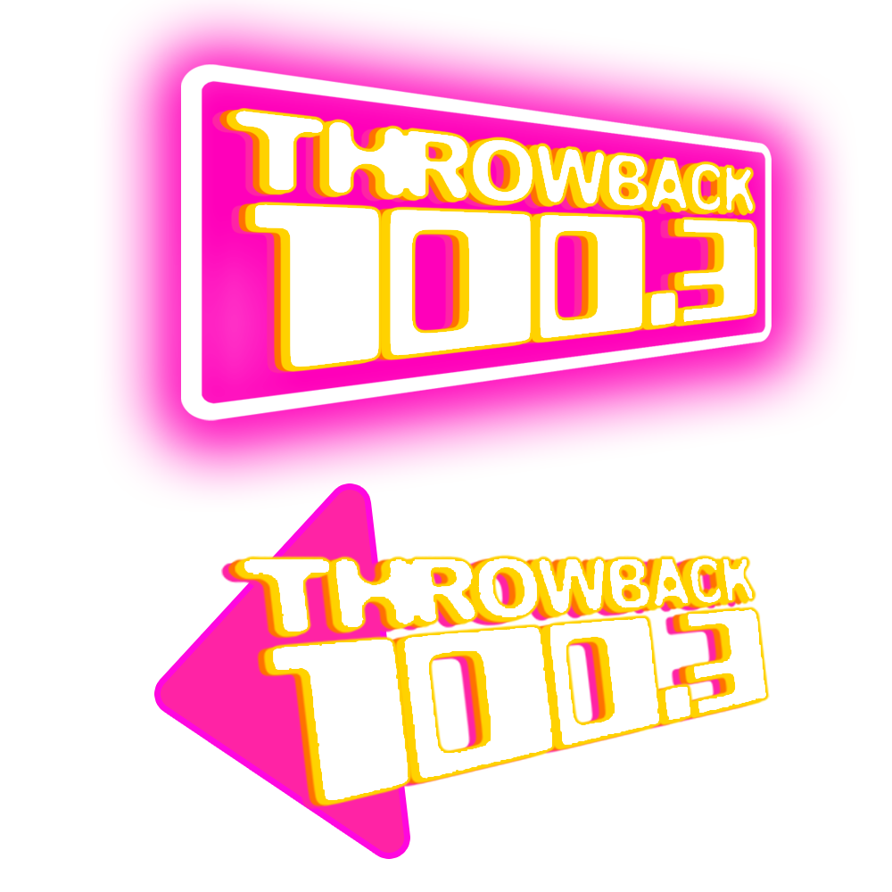
These logos to the left, were practice drafts, to kind of get a feel of what they were looking for. I went with the conventional “radio station look” at first, but none had quite captured the “vibe” they were looking for.
After coming up with these two designs, I remember thinking to myself:
I was ready to hear from the people deciding - DAMION. THIS. IS. THE. ONE…You nailed it!
Still not what they were looking for.
“How do I create a visual that conveys a sonic sound?” “Sonically.” Hmm…That word kept reverberating throughout my head in my process, so - I started there. I wanted to create a logo that had different elements of sound to it’s design. I wanted something that showed motion. Something fun. Something that is trying to grab your attention.
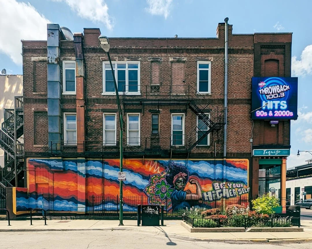
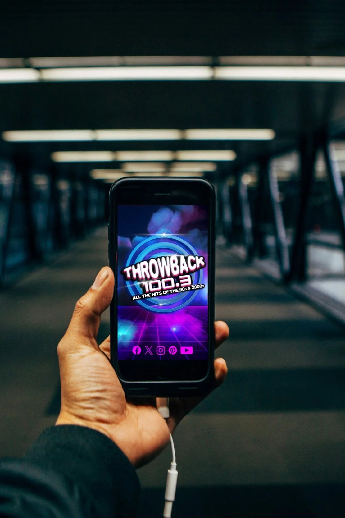
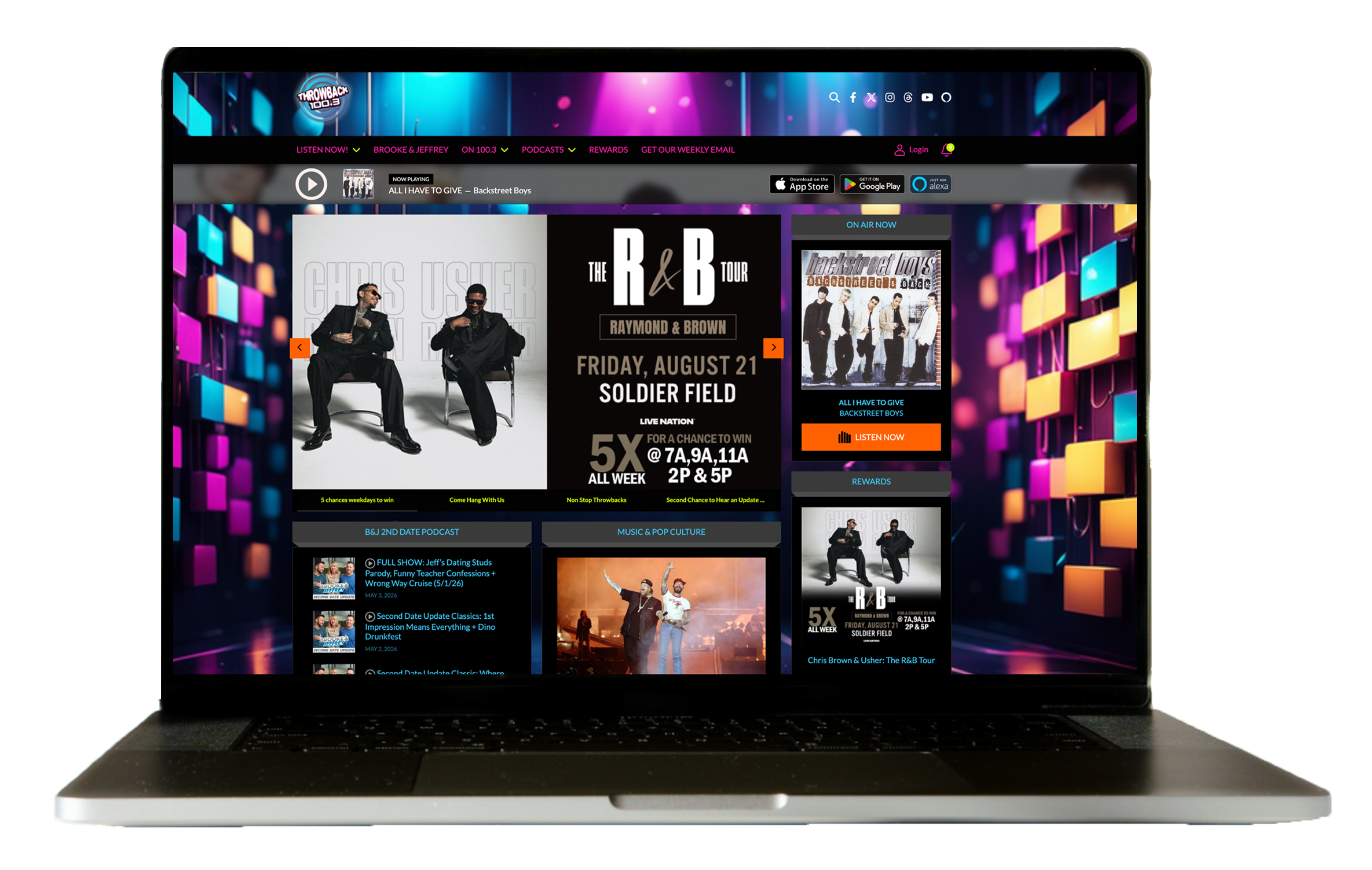
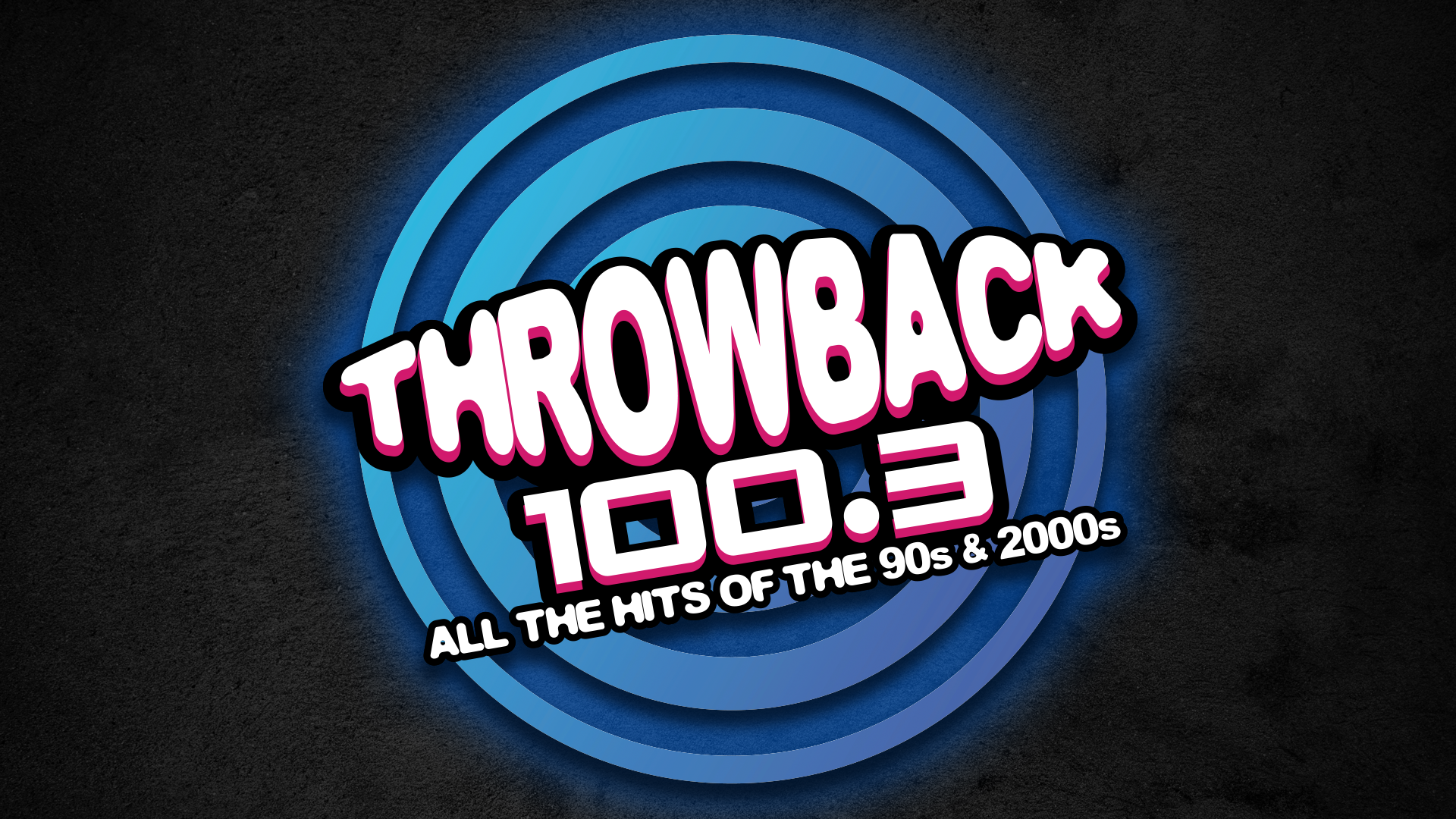
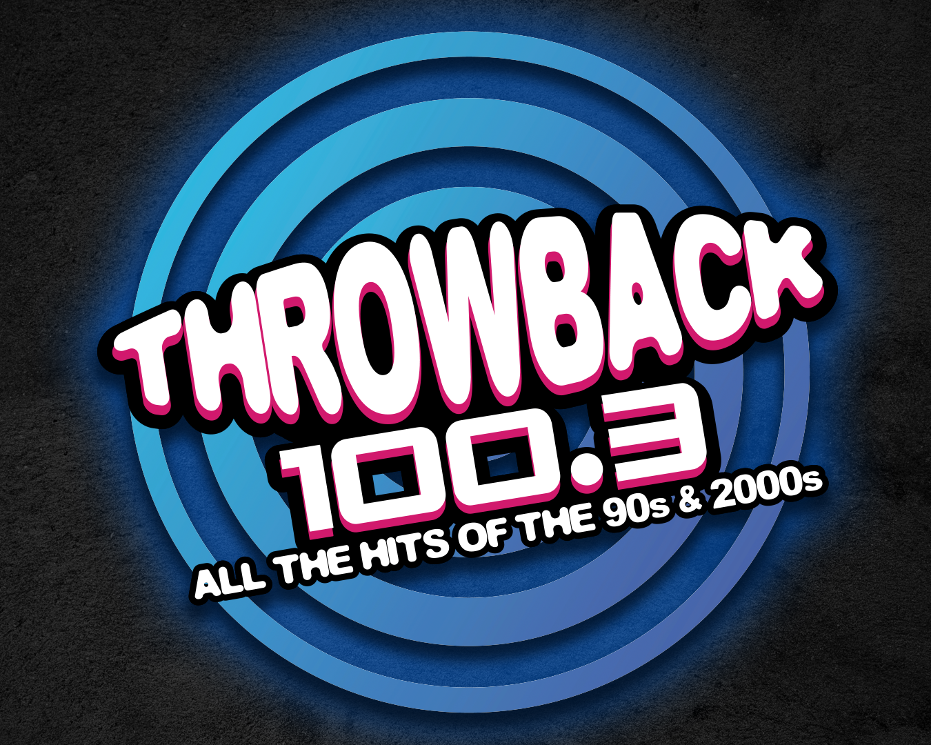
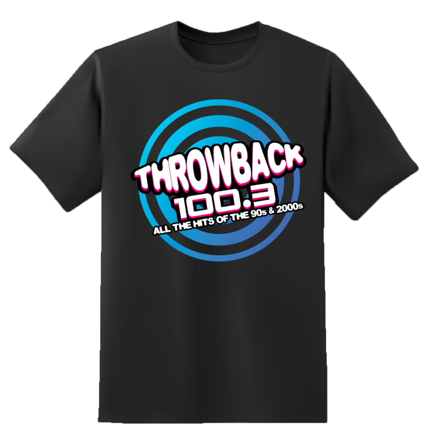
Which brought me to this design - which would ulitmately become the stations new brand. The rings behind the call letters are inspired by sound coming emanating through your speakers. Those rings brought me to a mindset of spinning compact discs. The colors also lend to the 90s/2000s vibe. The stylized stretched and pulled font as a topper. The whole look said to me: Throwback music bursting out of your speakers was exactly the look they wanted, and as the saying goes, the rest is history.
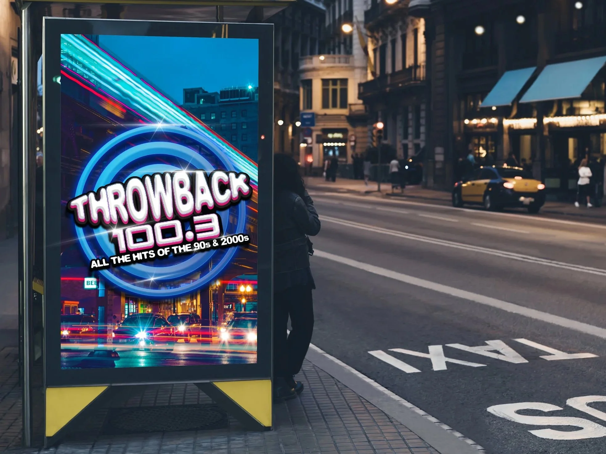
In your city…